Recent talk on the web about typography and the grid inspired me to pick up some books and do some reading and learning so I could expand my knowledge and produce more mature websites.
I wanted to try and give some insight on how I created Version Four using a grid, and how I went from wireframes to the finished website you see here.
Choose a Size
My first port of call was to choose my grid. I knew I wanted the new site to be optimised for 1024×768 which would allow me to stretch my arms out a bit and let me relax. Mint tells me (with the addition of the Real Estate Pepper) that less than 1% of my readers have a screen width of 800×600 so I was pretty sure I could make the change without alienating too many visitors.
The next step was to choose the size of the actual content area. I remembered reading a post on Authentic Boredom by Cameron Moll titled Optimal width for 1024px resolution? so my first port of call was to reread this article. In it, Cameron discusses the options for designing to 1024×768 but eventually settles for a width of 960px, as it can make some seriously modular grids. This is the width I decided to use.
Make a grid in Photoshop
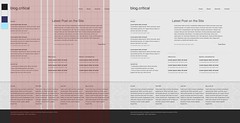
With the size now decided on, I cracked open Photoshop and created a new document, 1152×864 in size. I made a marquee selection from the top left of the document, which was 960px wide and as high as the document.
 I filled this selection with a 60×60 pattern which has a solid black line on the right hand side and the bottom side, then created a new layer and filled it with a 10×10 pattern which has a dotted black line on the right and bottom.
I then set the first layer I created to 20% opacity and the second to 12% opacity. Finally I created another new layer, moved it to the bottom of the stack, filled the selection with #990000 and set the opacity of 2%. I then put these three layers into a layer group and aligned them to the centre of the canvas.
Below is an example of what I ended up with, taken from the top corner of the canvas at 100% zoom, but cropped to fit in this post.

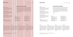
With the basic grid in place, I was able to create a varied amount of grid configurations, all of which where based on this simple framework. The maximum number of columns I could create was 16, I decided to add 10px of space between each column.

The diagram above shows some of the different grid configurations that can be created with a 16 column grid. I use 6 unequal columns on the home page of this site and the 5 columns for everywhere else.
Download Example Grids PSD (44kb)
The download linked above includes the grid I created, as well as some sample column configurations and the two patterns I used to create the grid.
Wireframe then Detail
 Now I had my grid I was able to use it to help me construct the look and feel of the home page. I already knew what elements I wanted on the home page, so I was able to use the grid to arrange them in an effective manner. I used single column spacing around the main article on the page to emphasise that it was the key element. Then slotted the other elements around it.
At this stage I was just working with black text and a white background making sure that the sections themselves could provide enough contrast and hierarchy on there own with out the need for adding colour or divisional blocks.
I made sure to keep each line of text aligned to the 10px baseline of the grid this ensured that the site would have a consistent vertical rhythm which would aid in the readability of the whole site.
 Once I was happy that the elements worked well together I was able to go back over them and flesh out the design, adding colour and contrast. I tweaked each element over and over until I was totally happy with the look and feel of the design before I started working on the mar-kup. Even during development things where changed and perfected.
To Be Continued
In the second part of this article I will show you how I took my designs and grid, and turned them into markup and CSS.
댓글 없음:
댓글 쓰기